
Foresite Design Editorial Team · January 2026
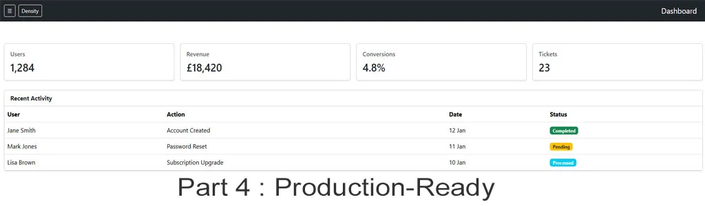
Production-Ready Bootstrap 5 Dashboard Layout
In this final part of the Bootstrap 5 dashboard tutorial series, we bring everything together into a fully production-ready admin interface.
Up to this point, you've:
- Built a mobile-first Offcanvas sidebar (Part 1)
- Structured responsive dashboard layouts (Part 2)
- Implemented visual hierarchy, link states, and accessibility (Part 3)
Part 4 focuses on readiness for real-world deployment - including desktop navigation behaviour, layout density, accessibility refinement, and performance considerations aligned with Core Web Vitals.
Prerequisites
- Completion of Parts 1–3 in this tutorial series
- Bootstrap 5.3+ included via CDN or compiled assets
- Basic understanding of responsive layout patterns
Desktop Sidebar: Progressive Enhancement
Your Offcanvas navigation already works perfectly on mobile. For larger screens, we enhance the layout rather than replace it.
The goal:
- Offcanvas for mobile
- Fixed sidebar for desktop
- Zero duplication of navigation markup
        <div class="bg-box mb-2 shadow position-fixed d-none d-lg-block" style="width:240px;height:100vh;">
         <nav class="p-3">
          <ul class="nav flex-column">
           <li class="nav-item">
            <a class="nav-link active" aria-current="page" href="#">Dashboard</a>
           </li>
           <li class="nav-item">
            <a class="nav-link" href="#">Reports</a>
           </li>
           <li class="nav-item">
            <a class="nav-link" href="#">Settings</a>
          </li>
         </ul>
        </nav>
        </div>

        <a href="#" class="copy-text" data-copy="desktop-sidebar">Copy</a>
Why this pattern works
- No JavaScript required
- Shared nav logic with Offcanvas
- Predictable layout for desktop users
- Fully reversible for smaller breakpoints
Main Content Offset for Desktop
Once the sidebar is fixed, content must shift accordingly.
        <div class="bg-box mb-2 shadow ms-lg-5 ps-lg-4">
         <main class="container-fluid py-4">
           <h1 class="h4 mb-4"></h1>
         </main>
        </div>

        <a href="#" class="copy-text" data-copy="content-offset">Copy</a>
This ensures:
- NNo overlap on desktop
- Full-width content on mobile
- Clean breakpoint behaviour
Dashboard Density & Card Composition
Production dashboards prioritise information density without clutter.
        <div class="bg-box mb-2 shadow row g-3">
          <div class="col-md-4">
            <div class="card h-100">
              <div class="card-body">
                <h6 class="card-title">Users</h6>
                <p class="display-6 mb-0">1,248</p>
              </div>
           </div>
         </div>
         <div class="col-md-4">
           <div class="card h-100">
               <div class="card-body">
                 <h6 class="card-title">Revenue</h6>
                 <p class="display-6 mb-0">£18,420</p>
               </div>
             </div>
           </div>
         </div>

         <a href="#" class="copy-text" data-copy="content-offset">Copy</a>
Key principles
- Equal-height cards
- Predictable scanning
- Minimal headings
- No decorative excess
Core Web Vitals Optimisation Notes
This dashboard is intentionally lightweight and scores consistently high in Lighthouse without special tuning.
CLS (Layout Stability)
- Fixed sidebar dimensions
- No layout-shifting animations
LCP (Largest Contentful Paint)
- Minimal above-the-fold markup
- No blocking JavaScript
INP (Interaction to Next Paint)
- Bootstrap-native interactions only
- No heavy event listeners
Live Preview
Download the Final Demo Template
A working demo of this layout is available as a downloadable ZIP file.
It includes a clean HTML structure designed to score well in Lighthouse and serve as a reliable base for further development.
Download the Bootstrap 5 Dashboard Demo (Final)
Full tutorials
- Part 1: Offcanvas Sidebar Navigation
- Part 2: Dashboard Layout & Structure
- Part 3: Accessibility & Link States
- Part 4: Production-Ready Dashboard (This Article)
- Blog Home View more posts.