
Foresite Design Editorial Team · January 2026

Bootstrap 5 Offcanvas Navigation for Dashboards: Beginner-Friendly Tutorial
Learn how to create **mobile-first dashboards** where the sidebar converts into an Offcanvas menu on smaller screens. This tutorial includes **live code examples**, accessibility tips, and best practices for UX.
Using Bootstrap 5 Offcanvas avoids custom JavaScript while providing a responsive and modern experience.
Prerequisites
To follow this tutorial, you should have a basic understanding of:
- Standard HTML structure (
<html>,<head>,<body>) - Familiarity with HTML classes and attributes
- Knowing how to include Bootstrap 5 via CDN
- Ability to copy and paste example code into an HTML page
Step 1: Add the Desktop Sidebar
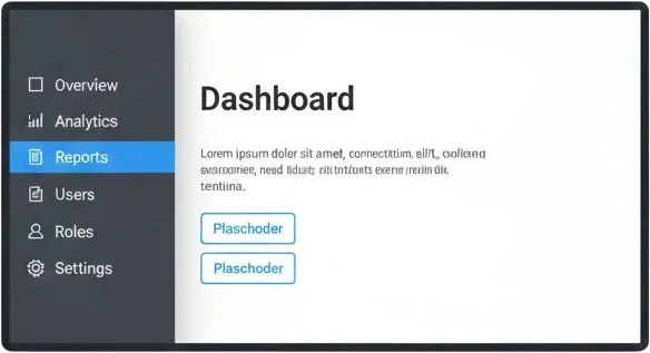
The sidebar is always visible on desktop screens, hidden on mobile using d-none d-lg-block. This keeps the interface clean on smaller devices.
Insert this code inside the <body> where you want the sidebar.
<aside class="sidebar d-none d-lg-block p-3">
  <h5>Dashboard</h5>
  <nav class="nav flex-column gap-1">
    <a class="nav-link active" href="#">Overview</a>
    <a class="nav-link" href="#">Analytics</a>
    <a class="nav-link" href="#">Reports</a>
    <hr>
    <small class="text-muted mb-1">Management</small>
    <a class="nav-link" href="#">Users</a>
    <a class="nav-link" href="#">Roles</a>
    <a class="nav-link" href="#">Settings</a>
  </nav>
</aside>
Screenshot: Desktop sidebar visible on full-width layout
Step 2: Add Mobile Toggle Button
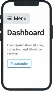
On mobile, add a button to open the Offcanvas menu. Place it near the top of your dashboard content. This button is hidden on large screens (d-lg-none).
<button class="btn btn-outline-secondary d-lg-none"
    type="button"
    data-bs-toggle="offcanvas"
    data-bs-target="#mobileNav"
    aria-label="Open navigation">
  ☰ Menu
</button>
Screenshot: Mobile toggle button visible on small screens
Step 3: Create the Offcanvas Sidebar
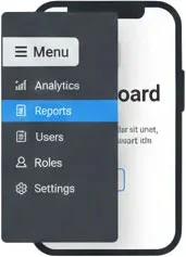
The offcanvas menu replicates the desktop sidebar links. Place this near the bottom of your <body> or directly after the toggle button. On mobile, it slides in from the left.
<div class="offcanvas offcanvas-start d-lg-none" tabindex="-1" id="mobileNav">
  <div class="offcanvas-header">
    <h5 class="offcanvas-title">Dashboard</h5>
    <button type="button" class="btn-close" data-bs-dismiss="offcanvas" aria-label="Close"></button>
  </div>
  <div class="offcanvas-body">
    <nav class="nav flex-column gap-1">
      <a class="nav-link active" href="#">Overview</a>
      <a class="nav-link" href="#">Analytics</a>
      <a class="nav-link" href="#">Reports</a>
      <hr>
      <small class="text-muted mb-1">Management</small>
      <a class="nav-link" href="#">Users</a>
      <a class="nav-link" href="#">Roles</a>
      <a class="nav-link" href="#">Settings</a>
    </nav>
  </div>
</div>
Screenshot: Mobile offcanvas menu open
Step 4: Live Preview
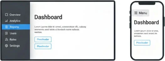
Resize your browser to see how the sidebar becomes a toggleable offcanvas menu on smaller screens. Use the button above to open/close it. This live example is fully functional for beginners to test.
Main content area. Resize to mobile width to see offcanvas functionality.
Screenshot: Side-by-side desktop and mobile view
Extra Tips for Beginners
- Always test your dashboard at multiple screen sizes to ensure navigation works well on mobile and desktop.
- You can add icons using Bootstrap Icons:
<i class="bi bi-house"></i>before link text. - Add badges for notifications or new items:
<span class="badge bg-primary">New</span> - Keep your sidebar content organized with headings, separators (
<hr>), and spacing.